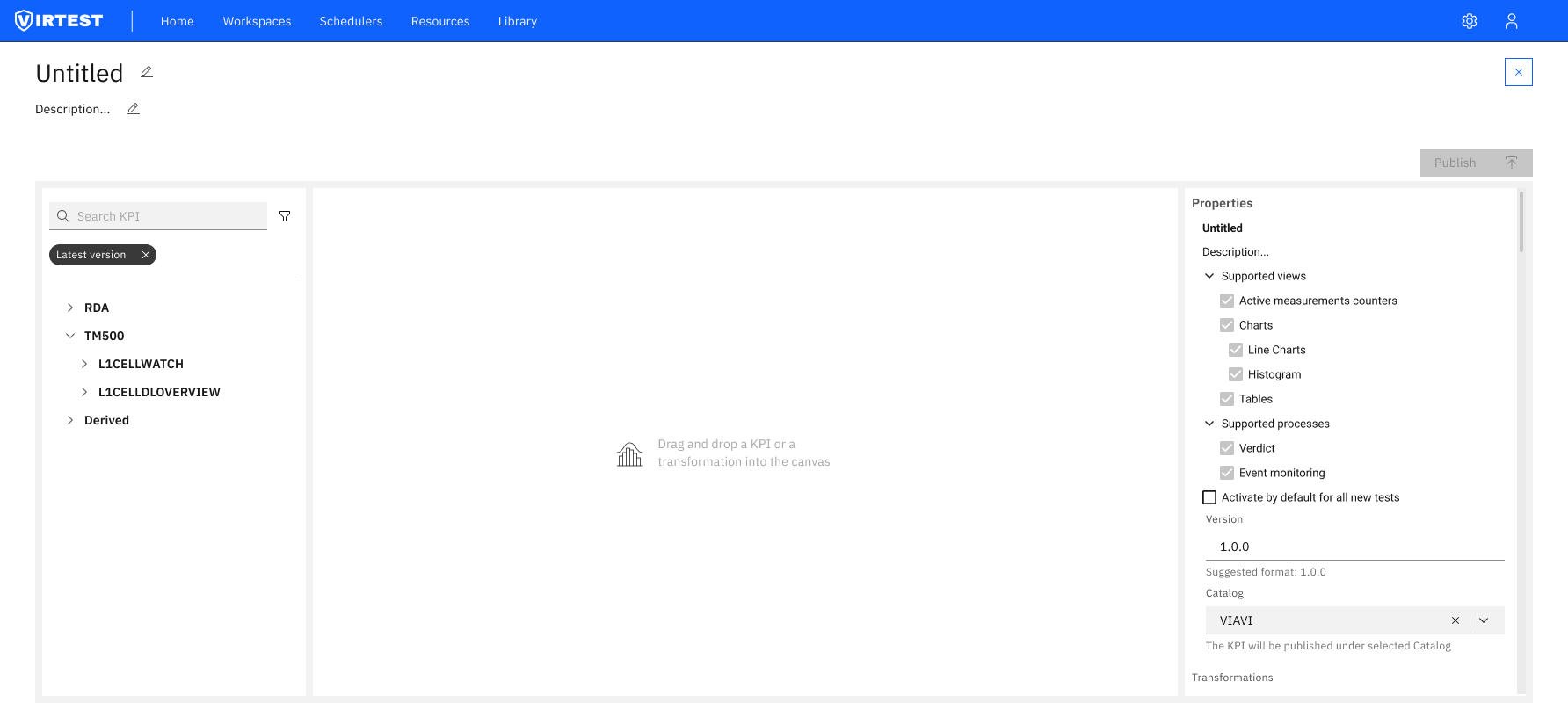
KPI Creator is a feature within the VIRTEST platform that enables telecom test engineers to build custom derived KPIs from base measurement data. Engineers select input variables from a hierarchical library of raw KPIs (organized by source: TM500, RDA, NASSTATS, TeraVM), write transformation logic, and publish the result to a shared catalog for reuse across the organization.
The feature sits in the Observability section of every workspace, where engineers configure which KPIs are tracked, how they're calculated, and how they're visualized in dashboards and test reports.
The original brief called for a visual drag-and-drop editor - engineers would drag KPI chips onto a canvas and chain them with transformation blocks, similar to a node-based programming environment. The concept tested well conceptually: it felt approachable, visual, and didn't require knowing any syntax.
The approach held up for simple cases. But as complexity grew (nested aggregations, grouped transformations, time-windowed calculations), the canvas became a tangle of colored blocks that was harder to read than the formula it represented. And when the AG Grid library chosen for the canvas implementation revealed fundamental limitations in handling nested dynamic structures, the entire visual approach needed rethinking.
The constraint became the catalyst.
- KPI chips dragged onto canvas
- Transformation blocks chained visually
- Readable for simple cases
- Broke down at scale, nested blocks became unreadable
- AG Grid couldn't handle dynamic nested structures
- No way to see the full formula at a glance
- Python-like formula editor with syntax highlighting
- Color-coded variables by type (green = base, orange = derived)
- Autocomplete for variable names as you type
- Full formula visible in one view at any complexity
- Left-to-right data flow: Variables → Formula → Output
- Simpler to maintain, easier to share and reuse
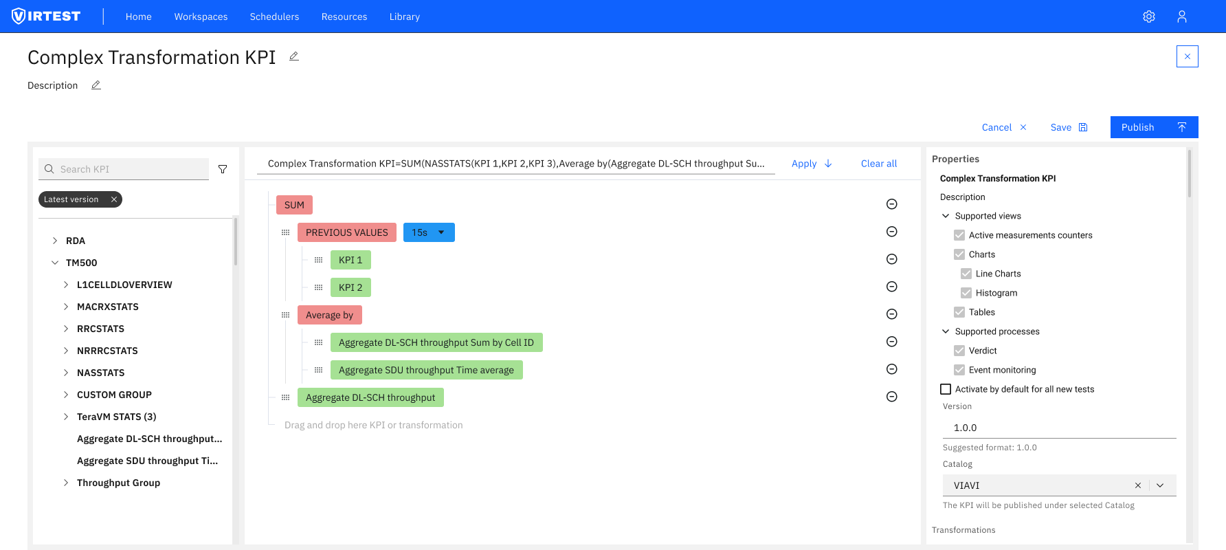
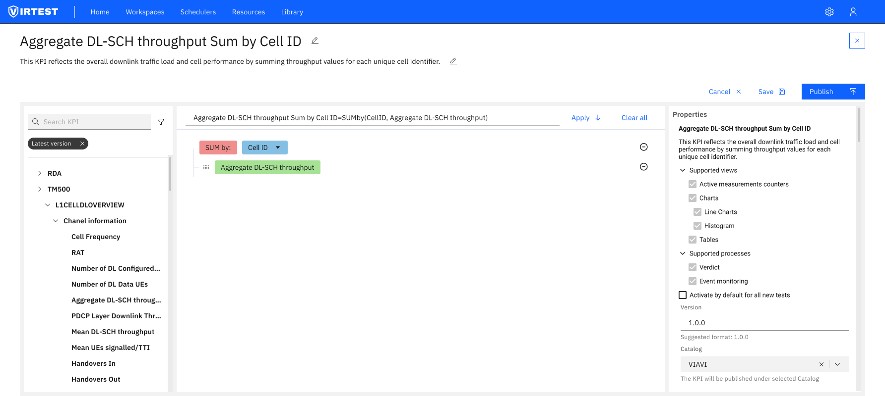
The redesigned editor is organized around a clear left-to-right data flow, the same mental model engineers use when reading a formula: inputs come first, the formula is in the middle, and the output configuration is on the right.
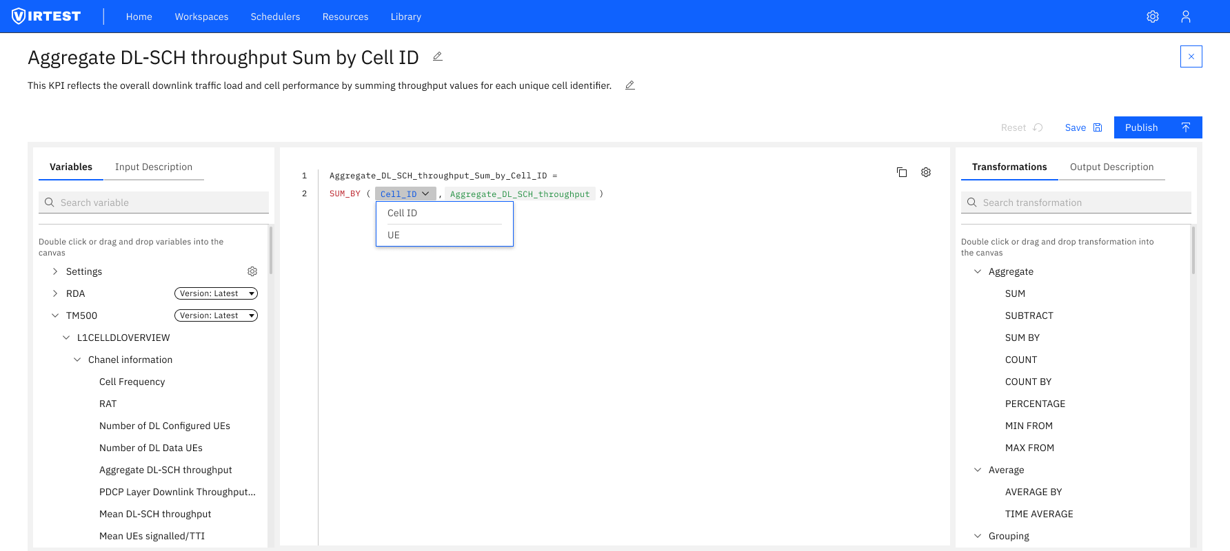
Color-coded variable types. Base KPIs render in green. Derived KPIs and transformation functions render in orange/red. This visual distinction means engineers can immediately understand the composition of a formula, which values are raw measurements and which are already processed, without reading every token.
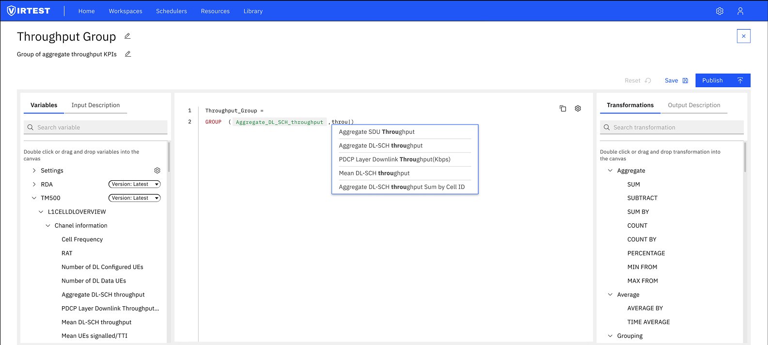
Autocomplete as guidance. Typing a partial variable name triggers a dropdown showing all matching KPIs from the loaded library. This eliminates the need to know exact names, reduces typos, and surfaces variables the engineer might not have known existed, effectively making the library discoverable through the editor itself.
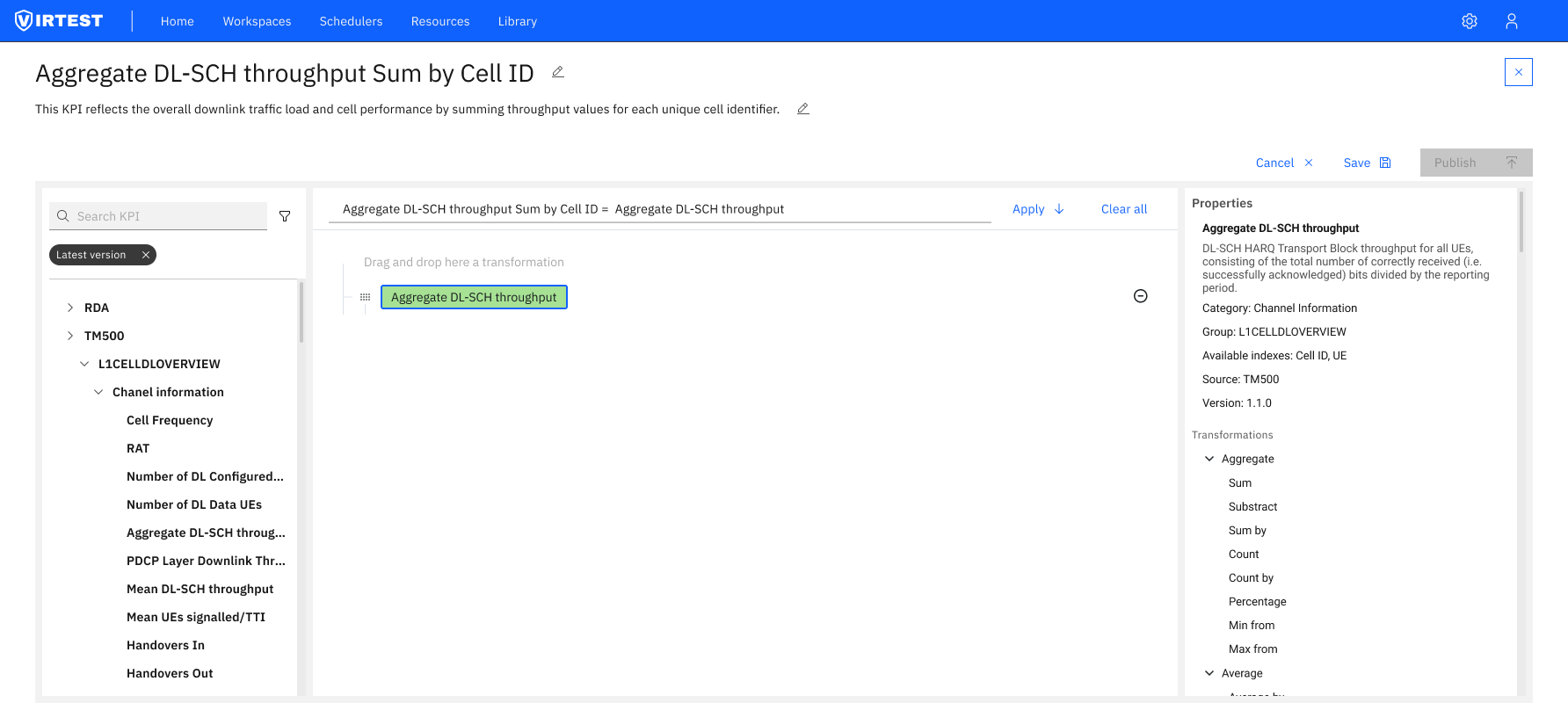
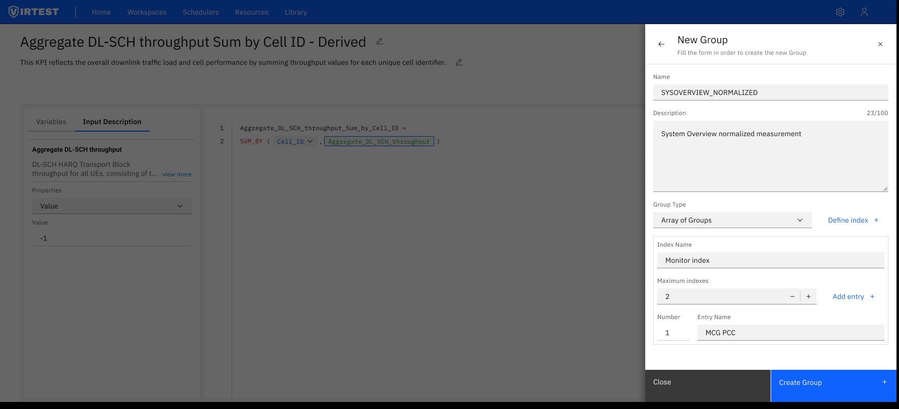
Input Description tab. Clicking a variable in the left panel shows its full metadata: category, group, available indexes, source system, version, original value, period, range, type, and unit. Engineers don't need to leave the tool to understand what a KPI represents or whether it's appropriate for their formula.
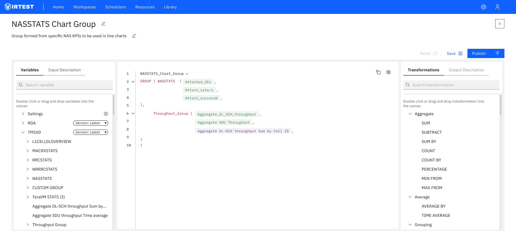
New Group panel. Creating a reusable KPI group opens a slide-over form: name, description, group type (Array of Groups), index name, maximum indexes, and named entries. Groups can be published to the VIRTUAL catalog and reused across workspaces and test cases, turning individual KPI definitions into organizational assets.
The pivot from visual to text-based editor reduced complexity for the majority of use cases, engineers who needed to write a SUM_BY formula no longer had to drag, connect, and configure multiple visual blocks to express what is fundamentally a two-line expression.
The reusability system: groups published to catalogs turned one-off KPI definitions into shared organizational assets. Engineers building new test cases could import existing groups rather than rebuilding from scratch, reducing setup time and ensuring consistency across the platform.
The color-coding system helped engineers understand formula composition at a glance, reducing the time spent tracing through which values were raw measurements versus derived calculations.
"The AG Grid limitation forced a complete rethink of the interface, and the rethink led to a more maintainable, more readable, and ultimately more user-friendly solution. Sometimes the constraint is the design."
Technical constraints can improve design. The instinct when a technical limitation kills your approach is to find a workaround. The better question is whether the constraint is revealing something about the approach itself. A formula is text, a text editor represents it more faithfully than a visual canvas does.
Settings vs data is the hardest UX distinction. The most persistent confusion in user feedback was between configuration settings (how a KPI is stored and versioned) and dynamic data parameters (what values it calculates over). Keeping these in separate panels: Transformations for data, Output Description for settings resolved most of the confusion without requiring any explanation.
Iterative refinement compounds. Each round of feedback revealed something new, the autocomplete gap, the need for Input Description metadata, the group publishing flow. No single iteration produced the final design. The quality came from running the loop enough times.