Makesure is an Australian platform where people complete background checks, Police Checks, Medical Assessments, Operator Licenses, Driver History, First Aid, and more. The platform is supposed to ease the process and save users from time-consuming administrative tasks.
Instead, the support team was getting buried. Complaint volume had been climbing steadily, with a consistent pattern: users couldn't find their way through the check completion process, didn't understand where they were in the flow, and had no feedback when something went wrong. The platform was losing trust at exactly the moment users needed to feel confident, while submitting sensitive personal documents.
My objective was to redesign the layout and flow from the point a user is assigned a check, all the way to the final submission.
Background checks involve private data, identity documents, medical records, employment history, personal details. Designing for this space means navigating real constraints: governmental regulations on how personal information can be handled across different regions of Australia, compliance requirements for document upload and verification, and a user base that comes in anxious by default.
You can't just make the interface prettier and call it a redesign. The friction users were experiencing wasn't cosmetic, it was structural. The platform had been built without feedback loops. Users took actions and nothing happened visibly. They uploaded documents and couldn't tell if it worked. They moved between steps without knowing how many were left. The anxiety that's natural when submitting sensitive government documents was being amplified, not reduced.
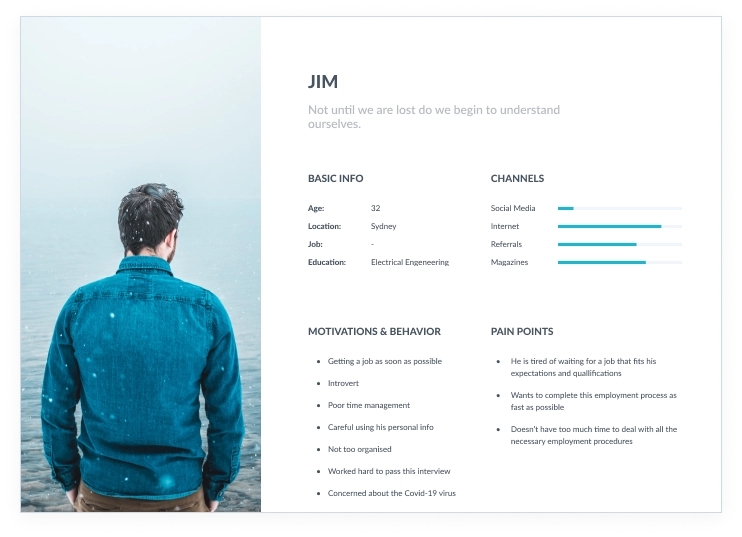
We built a persona (Jim) to anchor the research. Rather than making assumptions, we sourced the "Says" dimension directly from support tickets and existing user feedback. The "Thinks" and "Feels" dimensions were informed by that real data, pushed into assumptions we could design against.
- "Where should I start?"
- "Are there many steps to finish?"
- "Is my personal information safe?"
- "Is it legal?"
- "It would be hard to complete a check"
- "What would happen if I upload the wrong document?"
- "Am I good enough for this?"
- Logs in on the platform
- Starts to complete a check
- Uploads official documents
- Insecure · Overwhelmed
- Lost · Angry · Frustrated
The pattern was clear: every negative feeling the user had was rooted in uncertainty. They didn't know where they were, what came next, or whether what they'd done was correct. That became the north star for the redesign, if a design decision reduced uncertainty, it stayed. If it added any ambiguity, it was cut.
The client flagged that several competing platforms had launched after Makesure, and some were gaining ground. I reviewed each one systematically, what they did better, what patterns could transfer to Makesure, what problems they had that we could avoid, and where there was genuine room to lead.
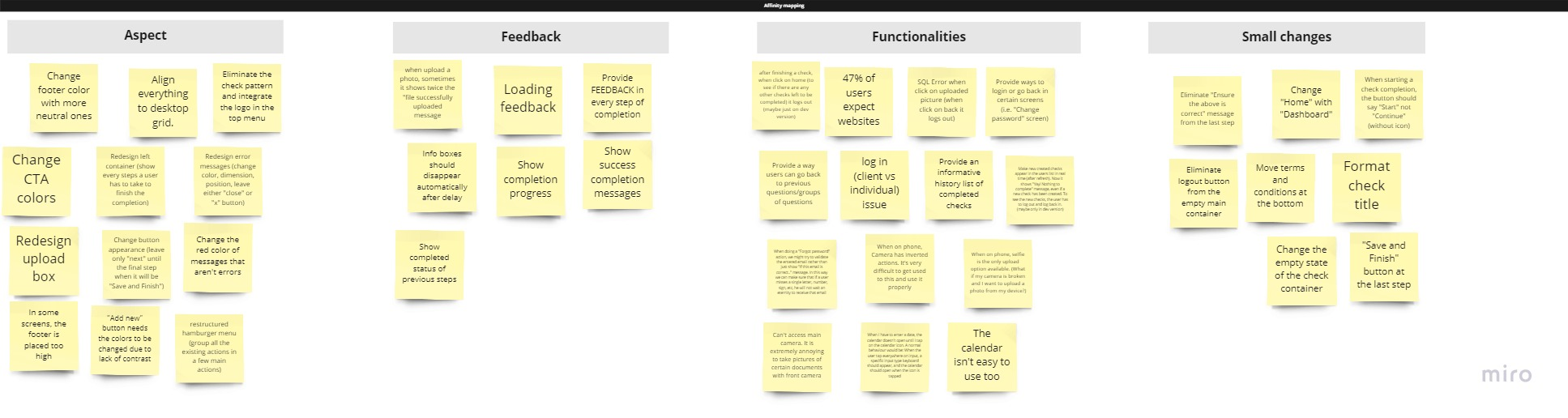
From that audit, and combined with the support data and empathy map, I ran an ideation session. The board filled with sticky notes across four categories: feedback improvements, functional additions, UX fixes, and small visual changes. Key themes that kept surfacing:
- Show completion progress at every step, users had no sense of how far through the process they were
- Add feedback for every action, uploading, saving, submitting all happened silently
- Redesign the upload experience, the existing box gave no guidance on formats, sizes, or success states
- Surface a success state at the end, the flow just stopped; users didn't know if their check had actually been sent
- Fix the loading states, actions that took time showed nothing; users couldn't tell if the platform was working
- Align the layout to a consistent desktop grid, elements floated with no visual anchor
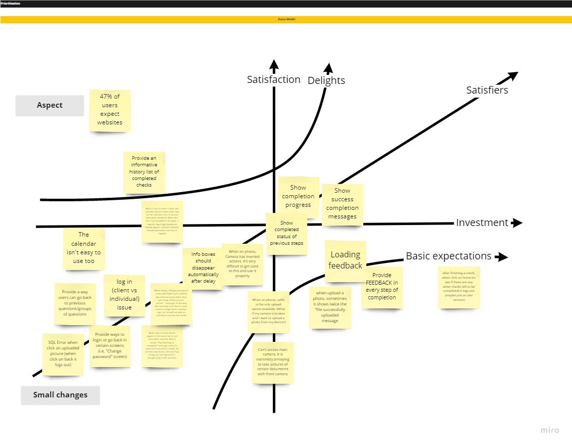
With a full board of ideas, the challenge shifted to sequencing. I used two frameworks back to back.
The Kano Model separated ideas into categories based on how users would emotionally respond to them: Delighters (unexpected, appreciated), Satisfiers (expected and valued), Basic Needs (expected but taken for granted when present, painful when absent), and Indifferent (neither missed nor appreciated). Most of the feedback issues landed in Basic Needs, users wouldn't praise you for having them, but they were actively frustrated by their absence. That made them non-negotiable.
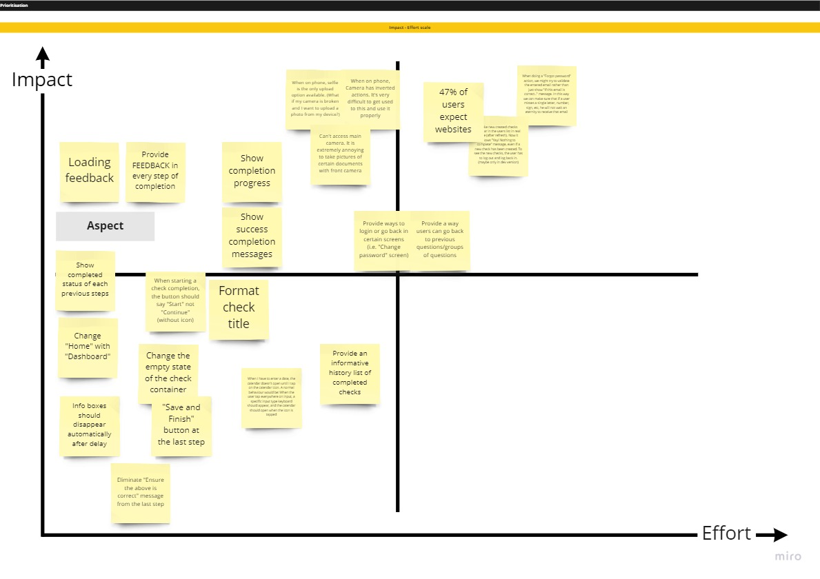
The Impact / Effort matrix then sorted the remaining ideas by how much value they'd deliver against how much development effort they'd require. Progress indicators, loading feedback, and the success screen were all high impact, low effort, first in the queue. Layout alignment and the upload redesign followed.
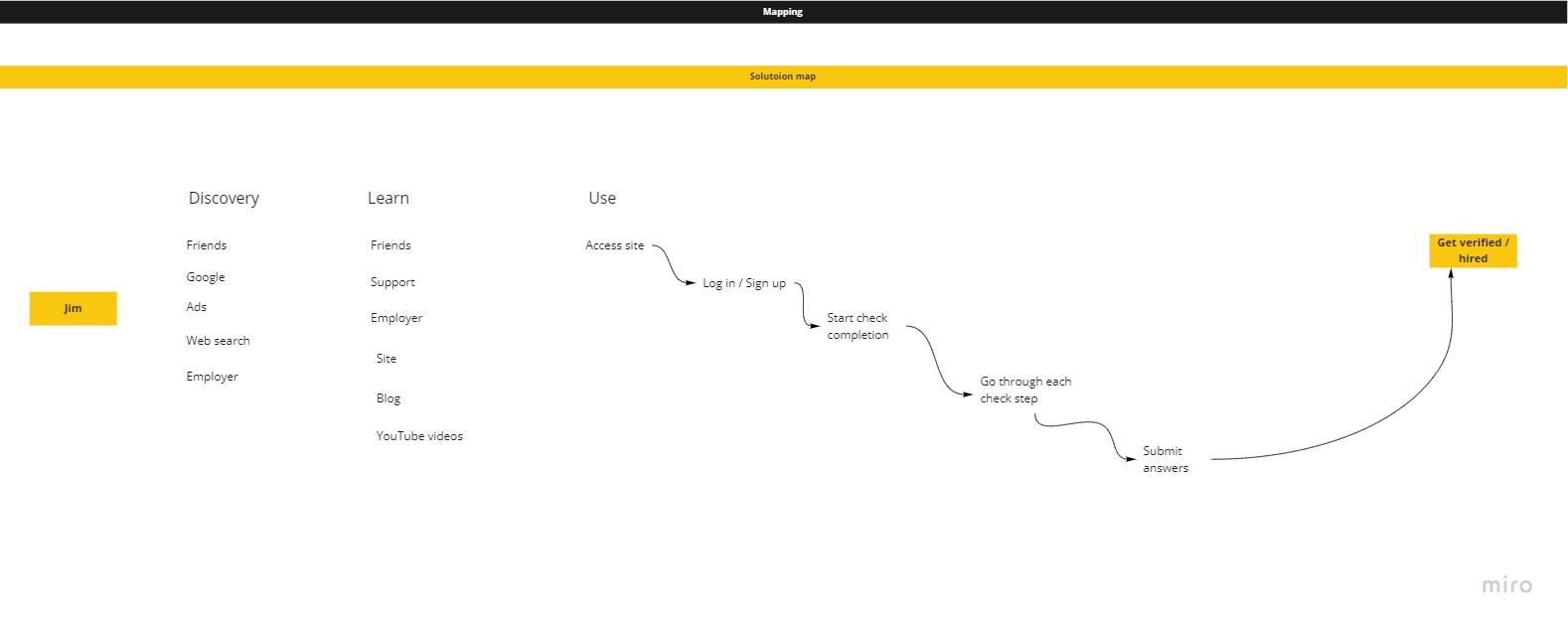
Before moving into design, I mapped the current user journey, from discovery through check completion, and the full site flow as a tree structure. The journey map showed where users dropped off and where uncertainty peaks occurred. The site map revealed structural inconsistencies: navigation that appeared on some pages and not others, dead ends after certain actions, and a check completion flow with no clear entry or exit state.
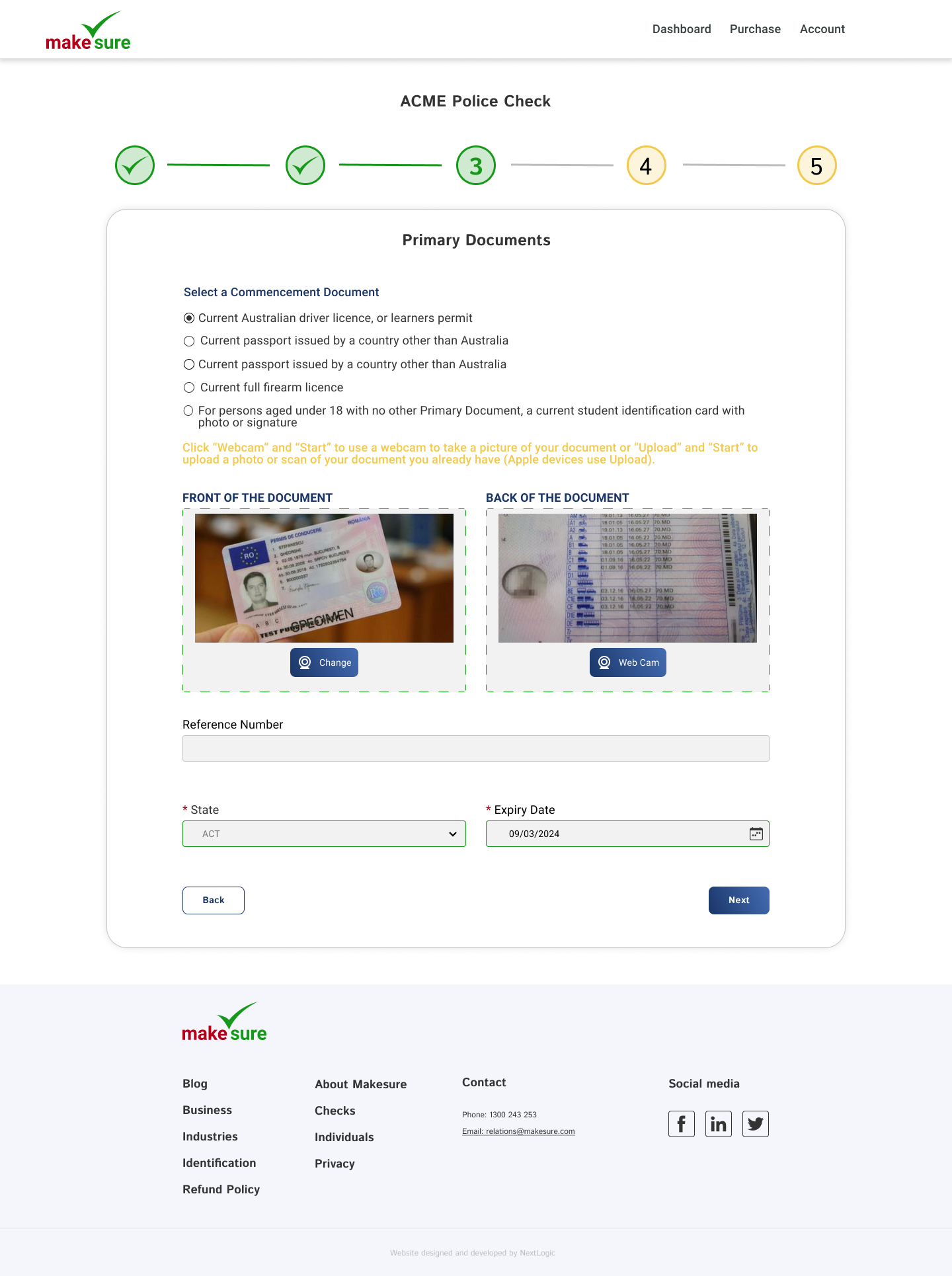
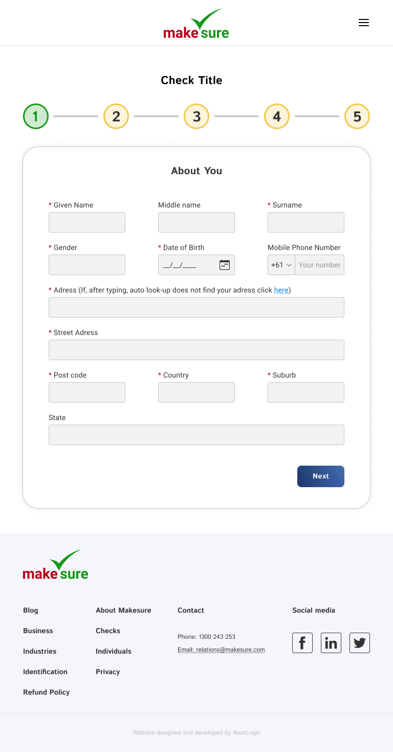
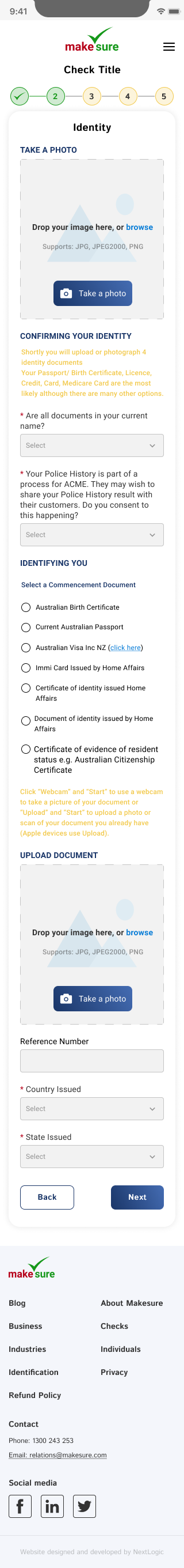
The redesign scope crystallised around the check completion flow: five steps from assignment to submission. Everything outside that flow was flagged for a later phase.
"A compliance platform shouldn't feel like compliance. Every design decision was tested against one question: does this reduce the user's uncertainty, or add to it?"
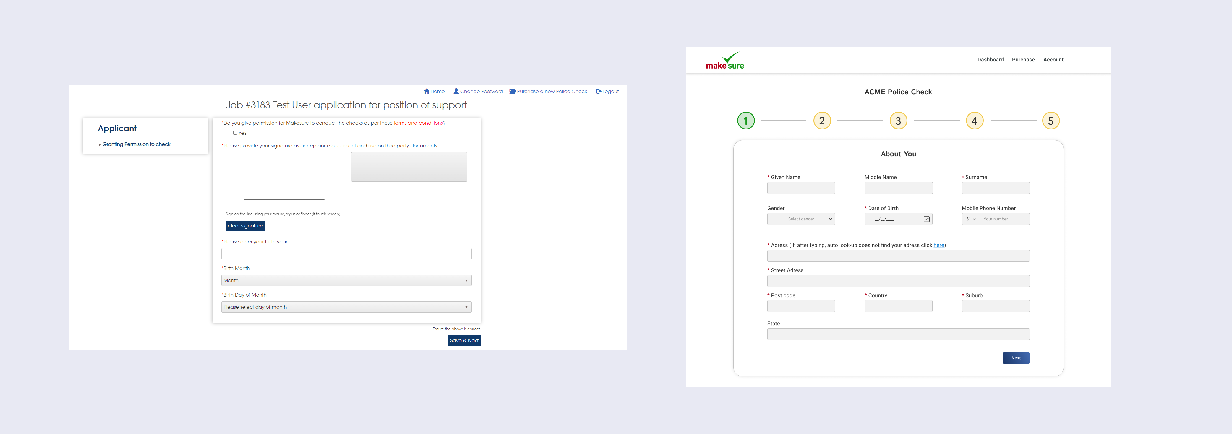
The core finding from research shaped everything: the interface lacked feedback at every level. Users didn't know where they were in the flow, how many steps remained, whether their input was correct, or whether their final submission had gone through. Besides the recurring login and password issues flagged by support, a consistent pattern emerged, users took actions and nothing happened visibly. The platform stayed silent.
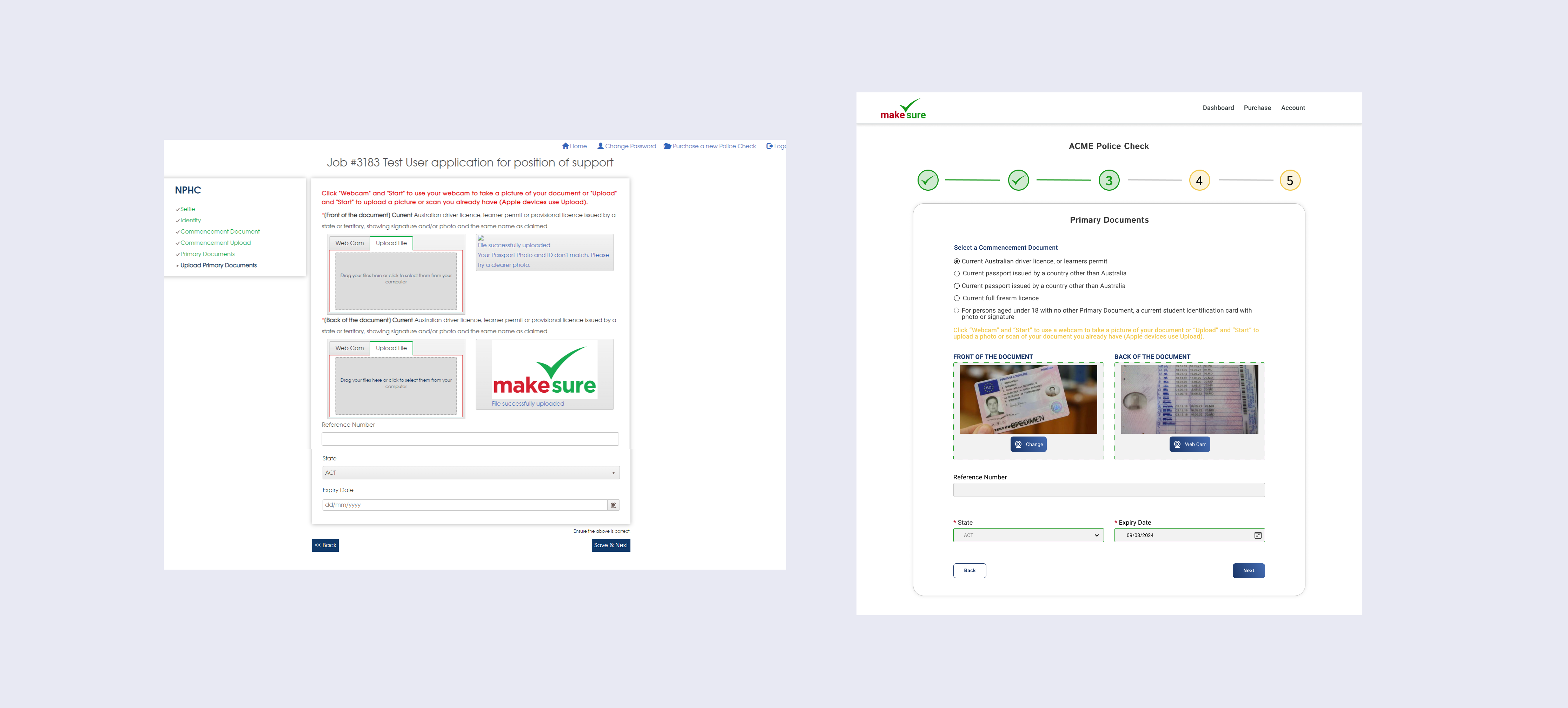
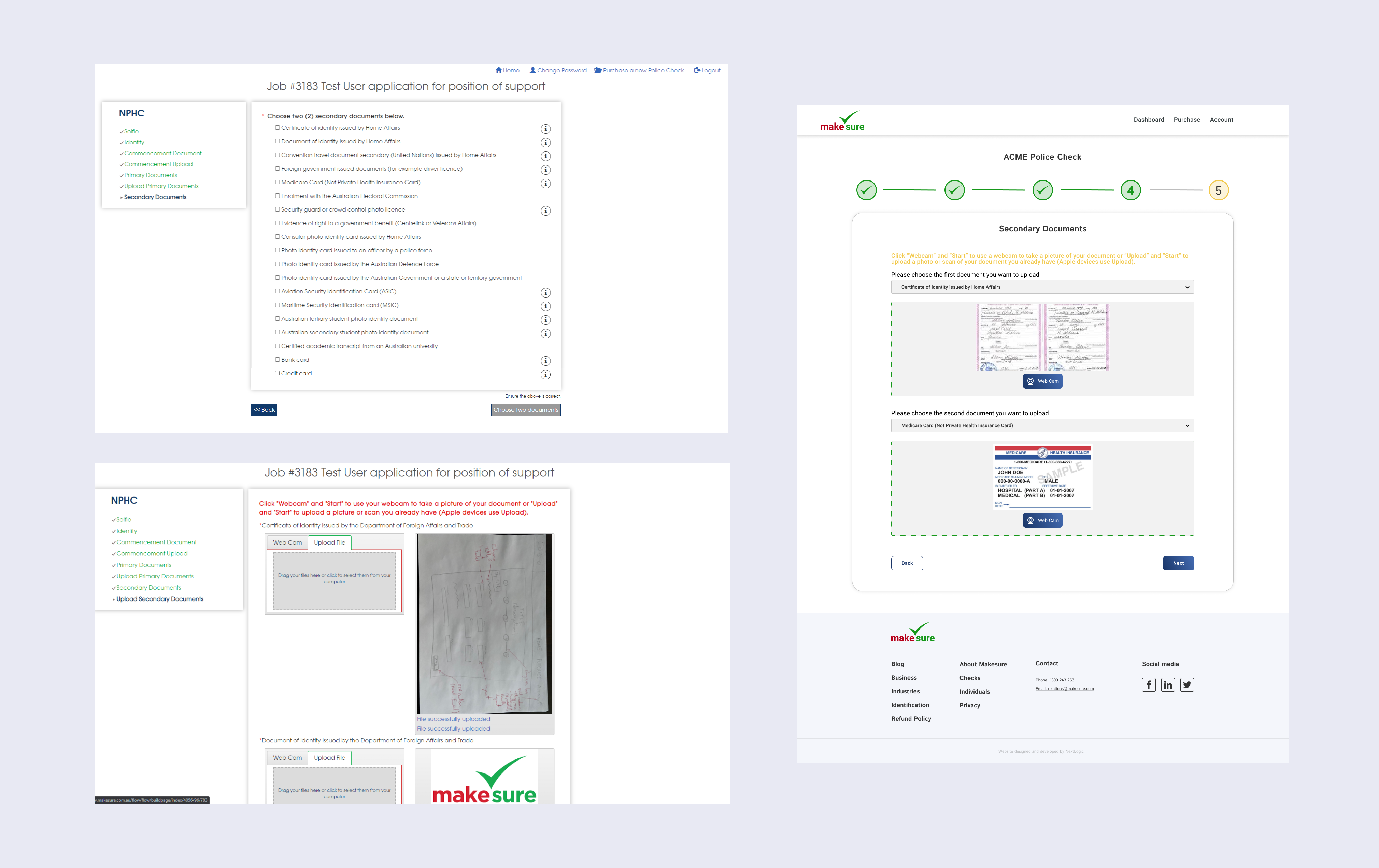
The redesign introduced a numbered step progress bar (five steps, with completed steps shown as green checkmarks) that runs across the top of every check screen. Each step has a clear label: About You, Identity, Primary Documents, Secondary Documents, Review & Grant Permission. The current step is always obvious. Completed ones are visibly confirmed. The final screen shows a full-bleed success state: "Done - Thank you for successfully completing and sending this check."
Document upload was rebuilt with labelled drag-and-drop zones, a webcam capture option, and explicit format/size guidance. Validation errors appear inline, immediately, in red, not as a summary at the end. The footer is consistent across all breakpoints, and the layout snaps to a proper grid at desktop width.
Support tickets are a design brief. The complaints the support team was receiving weren't noise, they were precise signals about where the design had failed. Starting from real user verbatims, not assumptions, shaped every subsequent decision. The empathy map gave structure to what users were already saying.
Compliance context demands extra clarity. Users submitting identity documents are already in an elevated state of anxiety. Any ambiguity in the interface, unlabelled buttons, silent uploads, no completion state, gets amplified. The bar for clarity is higher than on a typical SaaS product, and the Kano model helped make that case for prioritising feedback improvements over feature additions.
Showing progress isn't just UX hygiene, it's trust infrastructure. The step progress bar wasn't a nice-to-have. For a process that involves handing over a passport scan or a police history, users need to know exactly where they are, how much is left, and that what they've done has been accepted. The redesign treated progress visibility as a core product requirement, not a UI detail.