Virtual Lab is the resource and lab configuration feature within VIRTEST, the system telecom test engineers use to define their physical lab environments, manage test equipment, and establish the connections between test beds and devices under test (DUT).
Before a test case can run, engineers need to declare what equipment exists in their lab, how it's connected, and what's available to schedule. Virtual Lab is that declaration layer, and in a platform serving labs with 400+ racks and dozens of concurrent test engineers, the UX of that layer matters enormously.
The existing Resources section had accumulated functionality over time without a coherent structure. Related settings lived in separate tabs, causing engineers to navigate back and forth to complete a single task. Equipment definitions were duplicated across views. And critically, there was no way to see the lab. Engineers configured connections in tables but had no visual representation of what those connections actually looked like in physical space.
For a platform whose entire purpose is simulating and testing real telecom environments, the absence of a visual topology view was a fundamental gap. Engineers were mentally mapping physical connections from rows of data, and making mistakes because of it.
Three problems to solve: restructure the information architecture, add visual topology, and simplify connection management without removing the depth power users needed.

The first task was restructuring the navigation. Related functionality was merged into logical groupings rather than leaving it scattered across independent tabs. The result was a two-tier structure:
- Definitions section - portable configurations that travel with the test setup: equipment definitions, testbed configurations, test line definitions. Things you define once and reuse.
- Lab Site section - physical instances and systems: the actual equipment in an actual location, with its actual connections. Things that are specific to a place.
This distinction, portable vs physical, resolved most of the navigation confusion. Engineers working on a new test setup go to Definitions. Engineers managing an active lab go to Lab Site. The tabs themselves now communicated their purpose.
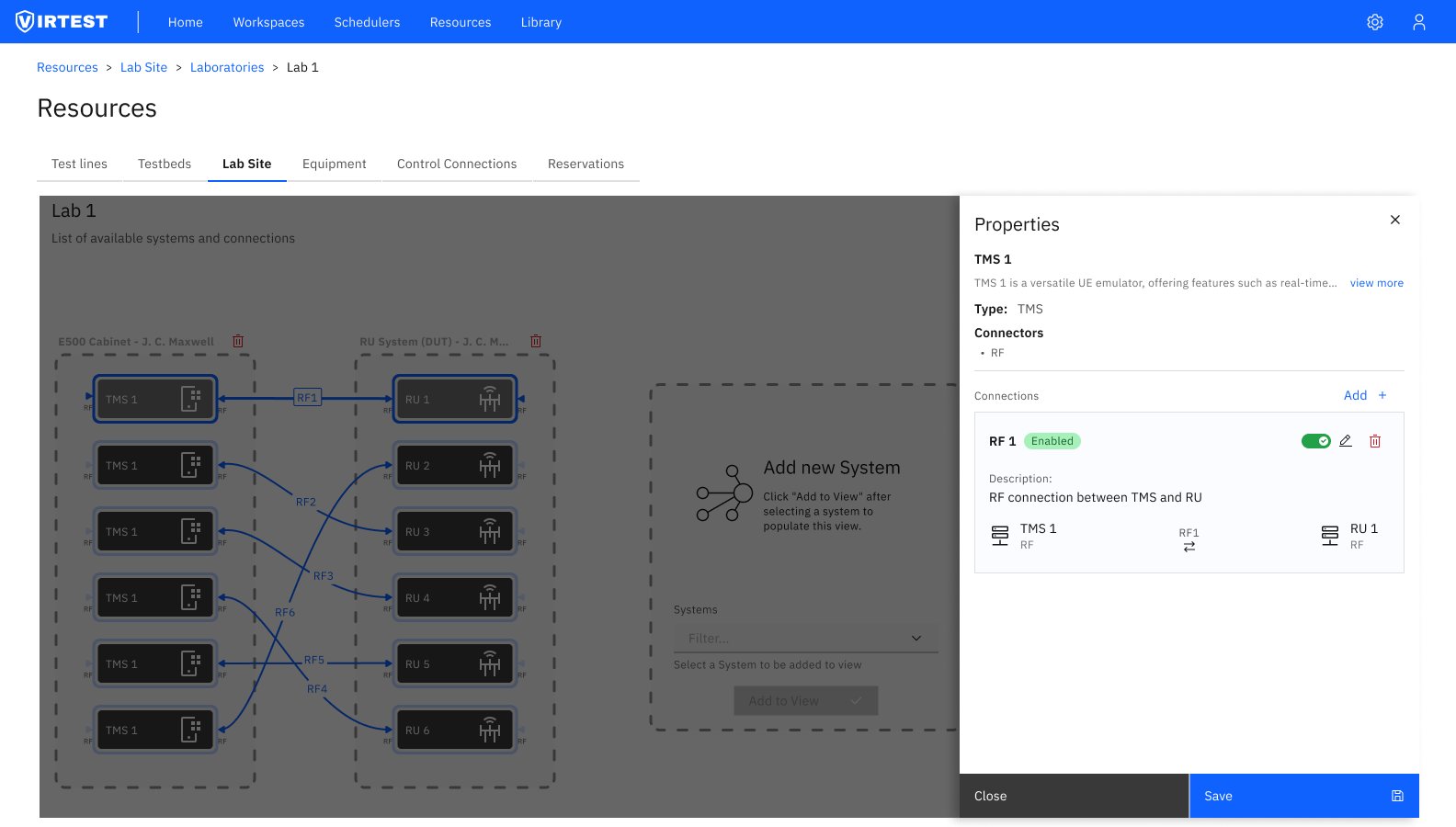
The topology view and table view serve different mental models, and different tasks. The design supports both, with a persistent toggle in the top right so engineers can switch without losing context.
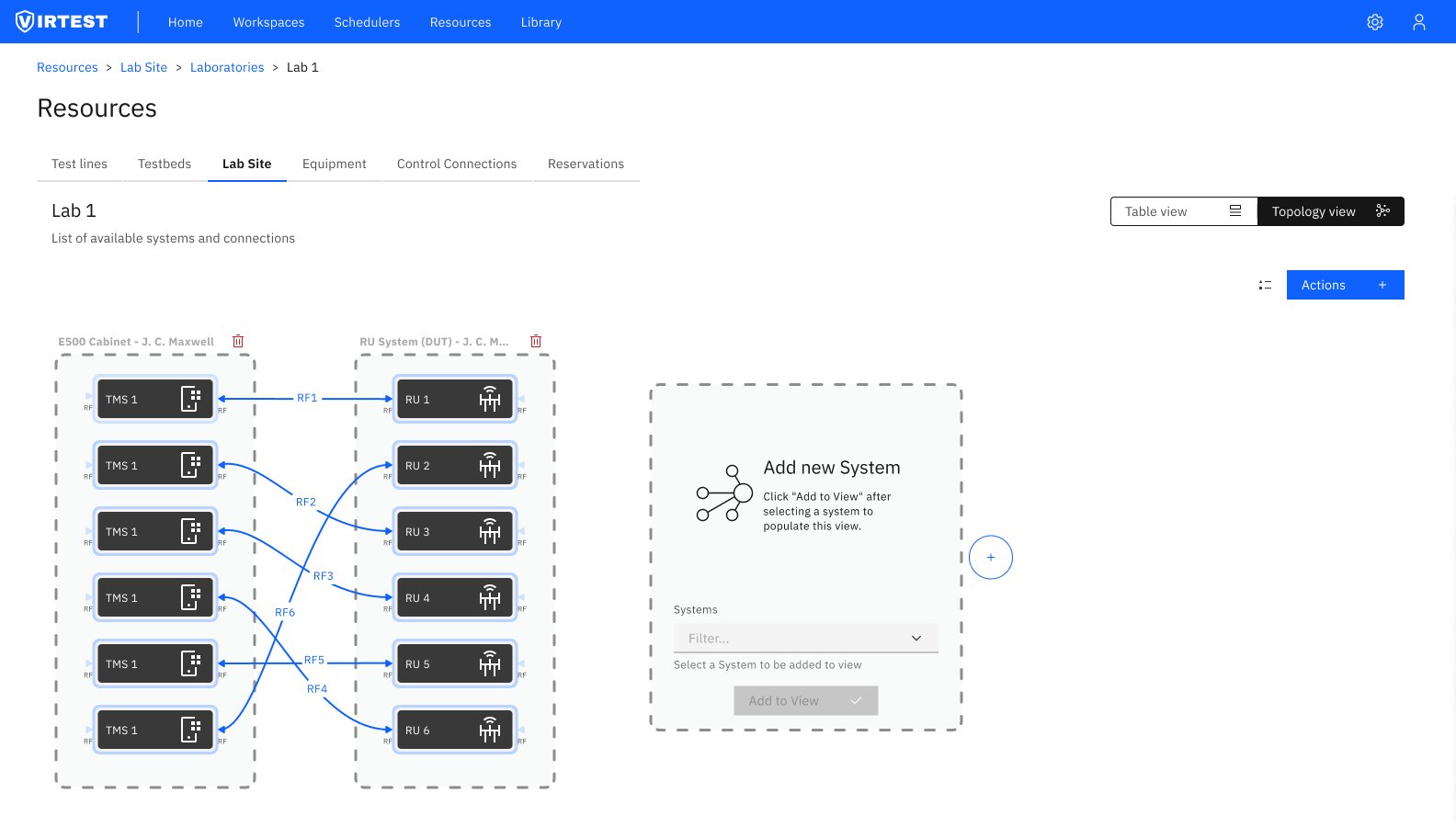
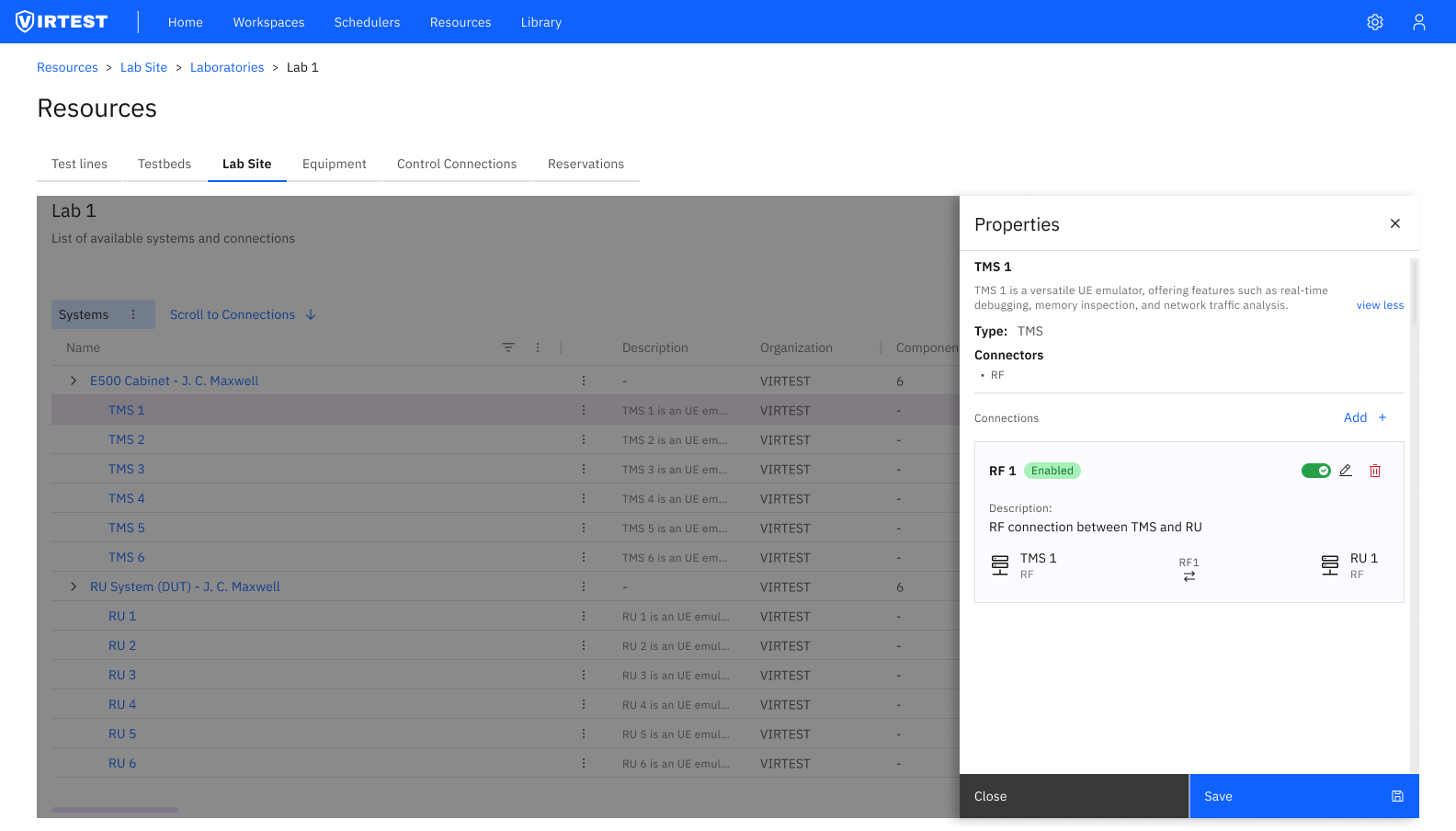
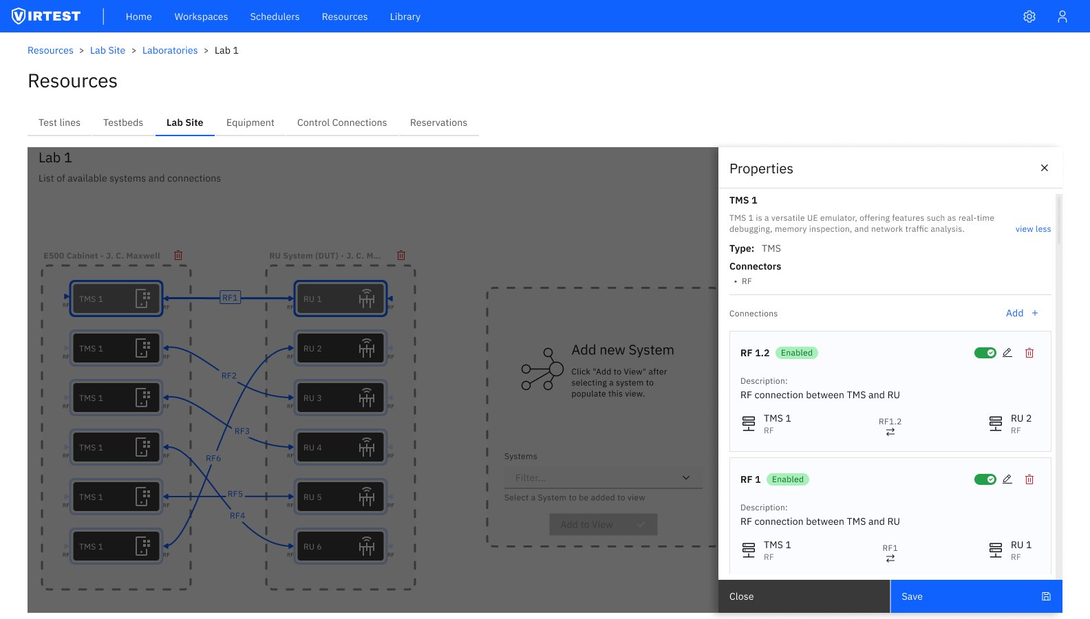
Managing RF connections between equipment is the most technically dense task in Virtual Lab. Each connection has a name, an enabled/disabled state, a description, and two endpoints, each with their own connector type. In a lab with 6 TMS units connecting to 6 RU units with cross-routing (any TMS can connect to any RU via different RF ports), the permutations multiply quickly.
The solution was a Properties panel that slides in from the right when a system or connection is selected, keeping the topology visible behind it rather than replacing it. The panel shows:
- System metadata (name, type, description, connector types)
- All connections for that system, each expandable to show full endpoint detail
- Enable/disable toggle per connection, so engineers can temporarily disable a connection without deleting it
- Inline Add button to create a new connection from the same panel
The visual topology view positioned VIRTEST as a comprehensive lab management solution, the ability to see the physical lab rather than infer it from tables was a clear differentiator from competing platforms. Stakeholders identified this as one of the feature's strongest selling points during review.
The IA restructure delivered clearer user pathways through the platform. Engineers who previously needed to visit multiple tabs to complete a lab configuration task could complete the same task within a single section. Duplicate information entry was eliminated by linking Definitions to Lab Site instances rather than requiring engineers to re-enter shared properties.
The Properties panel pattern showing context alongside the topology rather than replacing was subsequently adopted as a platform-wide pattern in VIRTEST, applied to other features that needed to surface detail without losing spatial context.
"The topology view wasn't just a visual feature, it changed how engineers thought about their labs. Once they could see the connections, they stopped making routing errors they'd been making for years."
Visualization changes behavior, not just perception. Adding a topology view wasn't cosmetic, it fundamentally changed how engineers interacted with their lab configurations. Errors that were invisible in table form became immediately obvious in the diagram. The best UX improvement here wasn't a better form; it was showing the data differently.
Two mental models require two views. The instinct is to pick one canonical view and optimize it. The reality in enterprise tools is that different tasks require different data organizations. A topology is useless for bulk auditing; a table is useless for understanding physical routing. Supporting both isn't redundancy, it's recognizing that the same data serves different purposes.
Scalability has to be designed in from the start. A lab with 6 TMS units and 6 RU units is manageable in almost any design. A lab with 400+ racks is not. Every design decision, from the panel system to the expandable groups to the view toggle, was made with the large-lab case in mind, even when the demo always used Lab 1.