Baking Goodies is a small patisserie run by Jessie Palacio, launching under the tagline “We bake it, you take it.” The identity needed to feel handmade without reading as cluttered, warm enough for a neighbourhood shop, professional enough to handle commissioned work for weddings and events.
Whimsical, not cluttered
Pastels, a hand-drawn whisk, and deliberate restraint.
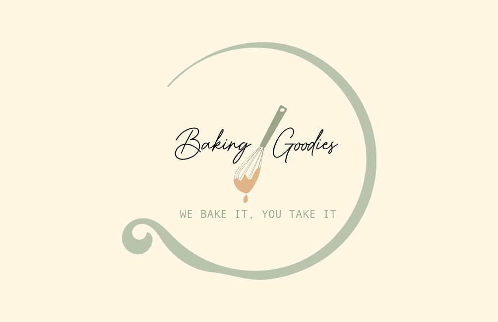
The system leans into soft pastels, cream, sage, muted rose, against a hand-drawn whisk motif dipped in batter, framed by a fluid circular flourish. Script typography carries the wordmark; clean sans-serif handles supporting type. The mix signals the two things this business needs to be at once: handmade and tidy.
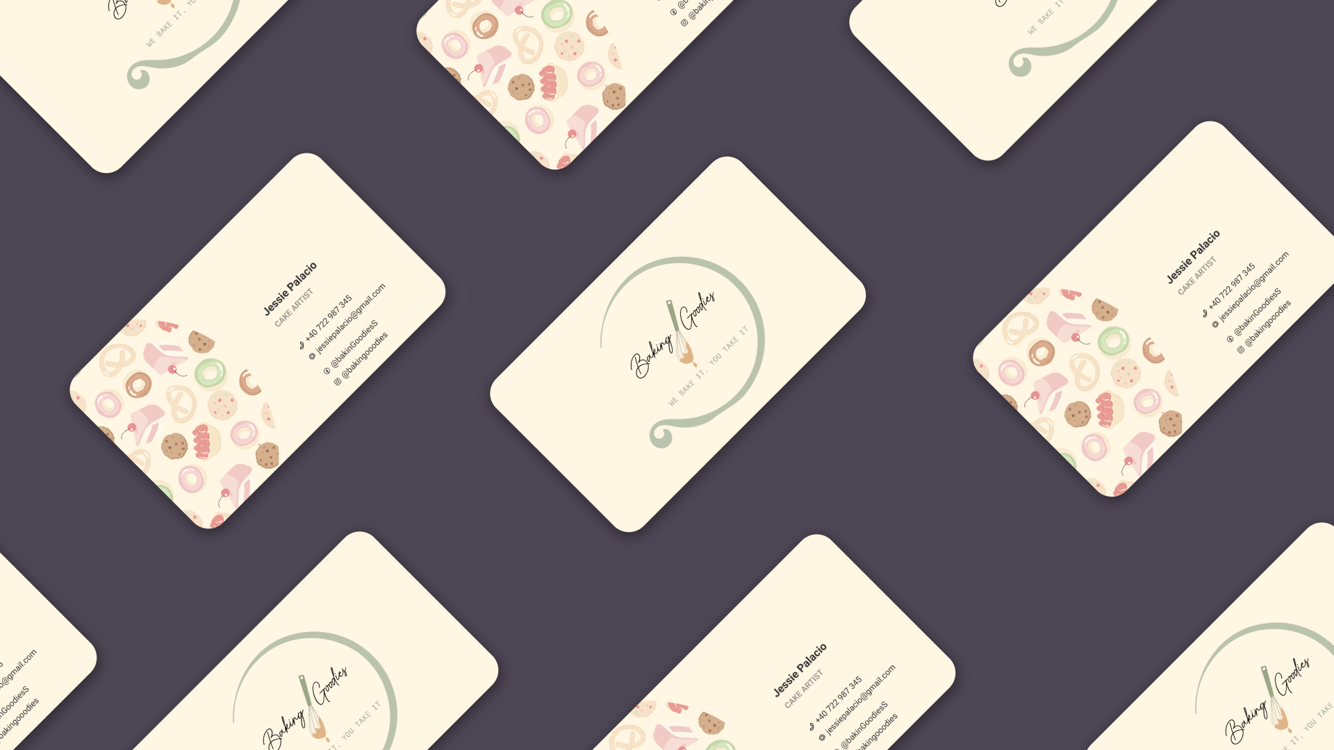
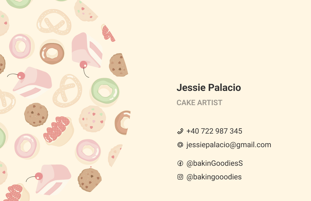
To carry the brand across physical touchpoints without losing consistency, I developed a playful pattern language of illustrative pastries, donuts, pretzels, cake slices, that shows up on the back of business cards and across incidental surfaces.
A toolkit for a local launch
- Primary logo - central whisk motif in a fluid circular frame, emphasising the craft of baking.
- Business card - minimalist front with logo and tagline; organised contact info on the back, set against a vibrant pastry pattern.
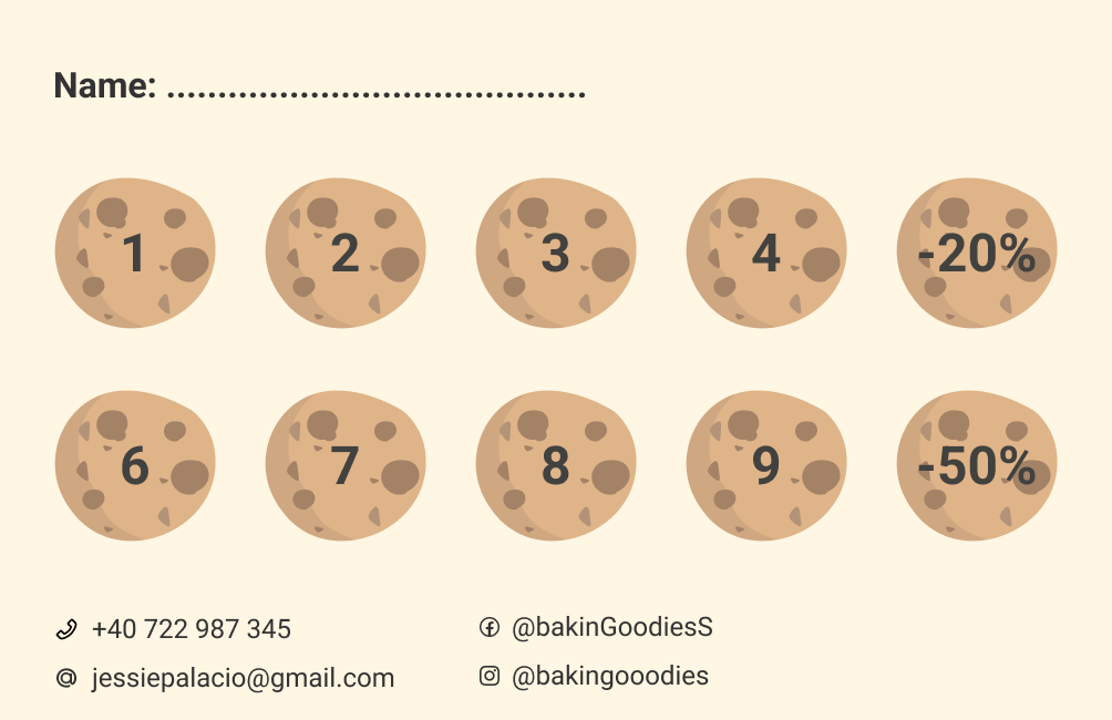
- Fidelity card - a “cookie-stamp” loyalty system with tiered rewards at −20% and −50%, designed to build a base of repeat customers.
A retention mechanic, baked in
The final identity gives Jessie a cohesive toolkit for launch. The fidelity card turned out to be the most strategic piece — a simple retention tool for a business that lives or dies on repeat customers. Everything else supports the same goal: make the shop feel trustworthy enough for commissioned work, and familiar enough to walk back into on a Saturday morning.