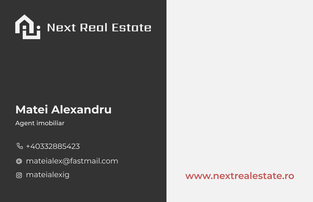
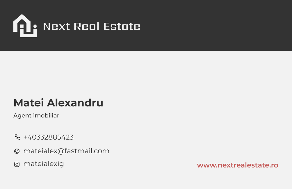
Business card design for Next Real Estate, a client whose separate website case study is covered elsewhere. The brief was narrow, deliver a mark and card system that felt premium, architectural, and distinctly not-corporate, but the surface carries a lot of weight in this category. Real estate is one of those fields where the business card is often the first real deliverable a prospect touches.
Matte black, neon framing
A premium card that doesn't announce itself.
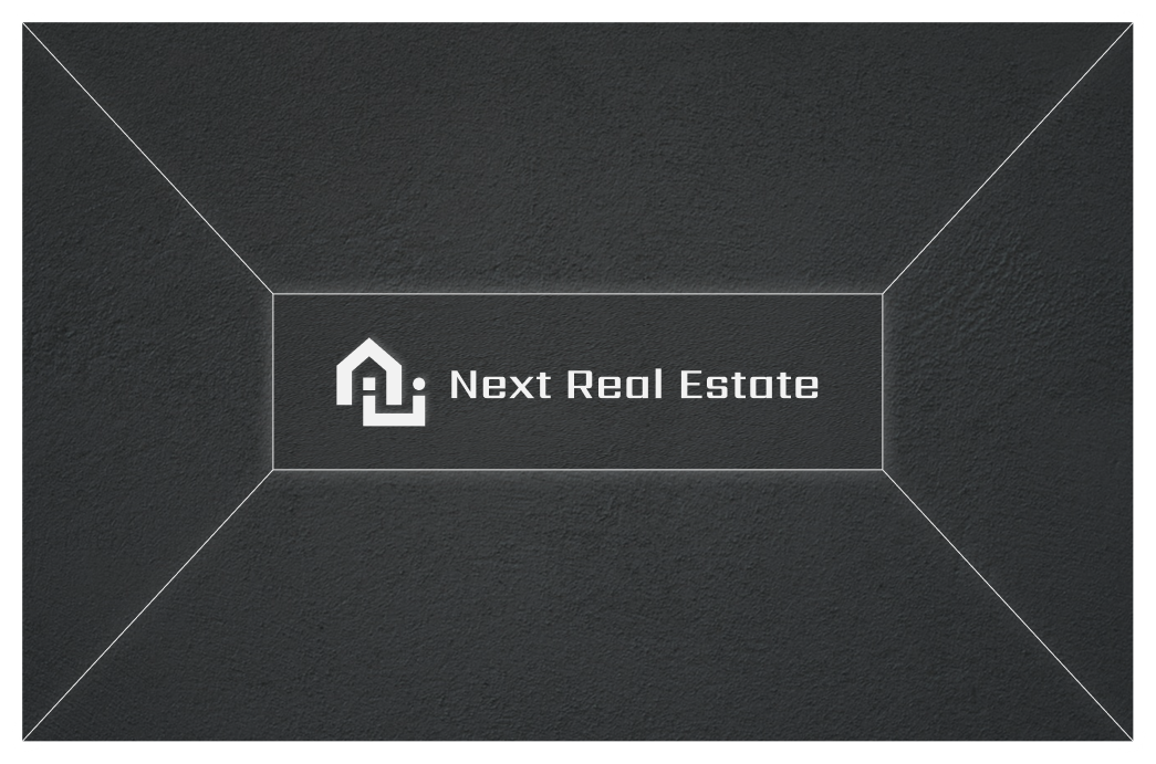
The front leans into a matte dark stock with neon slim-light framing that squares the logo. The effect is architectural, lines that imply a space, a threshold, a door frame, without being literal about it. The logo floats inside that frame; the stock does most of the talking.
Two clean options
Both work. The client picks the one that fits.
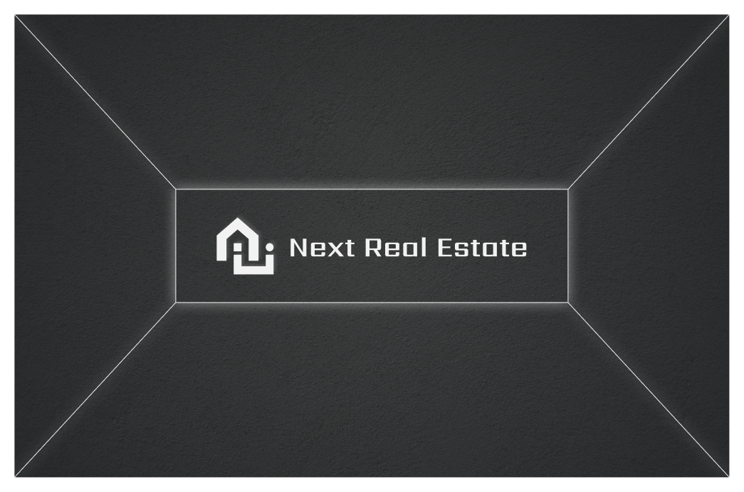
For the back, I delivered two iterations, both clean, both keeping the same tonal treatment as the front, but each setting the logo against a different textured surface. Rather than push one version, I presented both and let the client choose the one that felt right for their audience.