This case study covers a module I worked on as part of a larger product, a platform built to replace a spreadsheet-based system for managing accommodation bookings for sports teams and staff. The system handled high volumes of data: rooms, assignments, dates, and occupants across multiple facilities.
The client had been running everything in spreadsheets. It worked, barely, but coordinators were spending hours on tasks that should take minutes. My role was to design the booking module: a dense, data-heavy interface that needed to feel faster and less error-prone than the spreadsheet it was replacing.
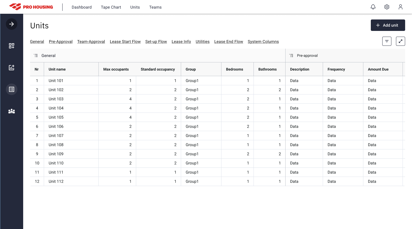
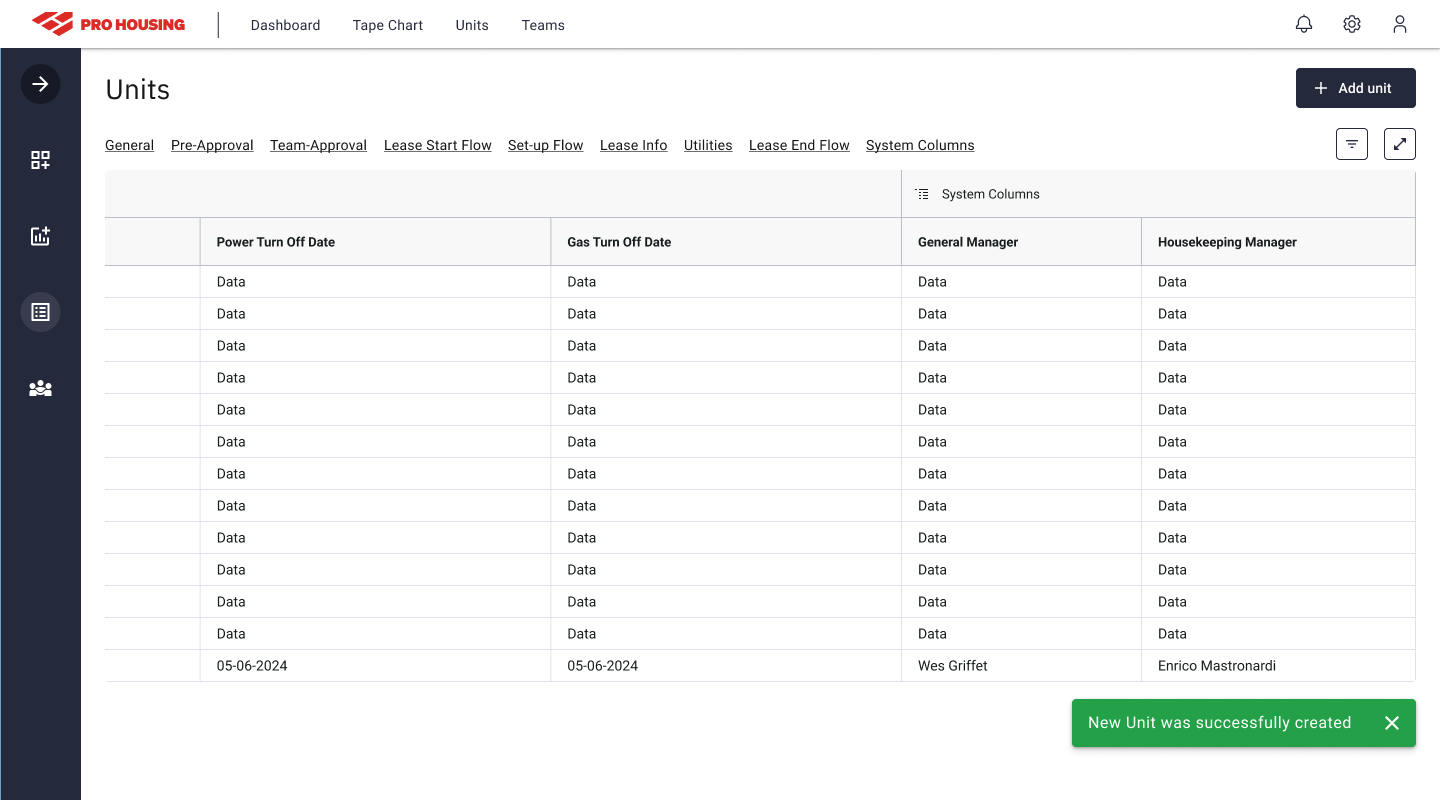
Spreadsheets for booking management reach their limits fast when volume is high. Each row is a unit. Each column is a field. Nothing enforces order, nothing guides the person filling it in, and nothing prevents a typo from breaking a downstream report. The client had several spreadsheets linked together, fragile, hard to hand off, and slow to navigate.
The goal was clear: build something that matches how coordinators already think about bookings, rows of units, columns of attributes, quick actions on individual or multiple records, but with structure, guided input, and speed that a spreadsheet can't offer.
This wasn't a ground-up reinvention. Coordinators were already proficient with the grid model. The design problem was removing friction from that model, not replacing it.
The client walked me through the existing workflow and the tools they'd tried before. For each, I mapped what worked and what didn't, which patterns were worth keeping and which were friction points worth eliminating.
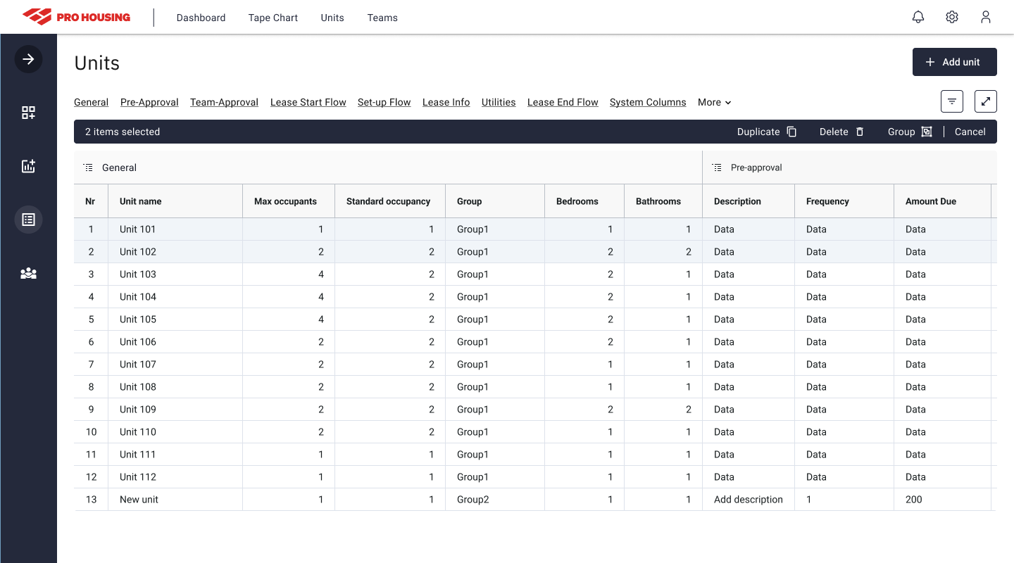
Strong points from existing tools: quick navigation between rows, persistent column visibility, and simple filters. Weak points: no guided input when adding a new unit, no bulk actions, no visual feedback for validation errors, and no way to change a unit's type mid-record without starting over.
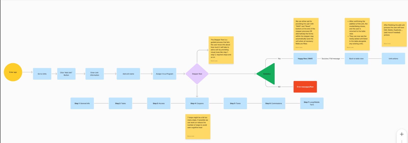
From that audit, I drafted the Add Unit flow (the most critical path in the module), and aligned it with the client before moving into design. Everything else was built around it.
"Replacing a spreadsheet isn't just a UI problem, it's a mental model problem. Every interaction had to feel more structured and less effortful than opening a cell in Excel."
The module was organized around four flows, prioritized by frequency and impact:
The visual design followed the client's brand guidelines. The interface uses a dark navy base with a high-contrast table structure, optimized for dense data at a glance. Color is used sparingly: red for actions that can't be undone, green for confirmations, amber for warnings.
The table is the primary surface. Sidebar navigation keeps the module context visible without taking up horizontal space the data needs. Every flow was prototyped in Figma and handed off with component specs to a team of two developers.
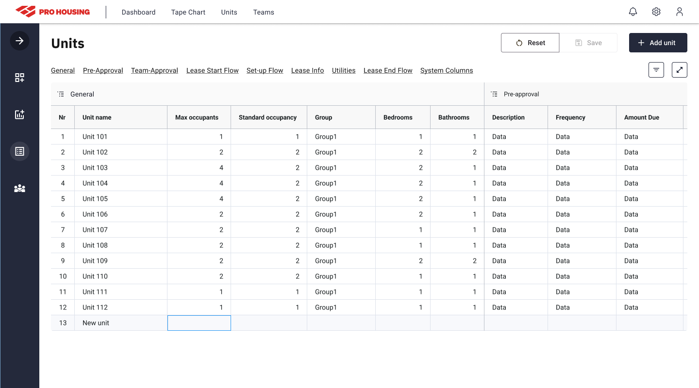
Design for the data, not the ideal user. Coordinators managing bookings for sports teams are not moving slowly, they're under time pressure, often switching between tasks. Every extra tap or confirmation dialog that wasn't absolutely necessary was removed from the flow.
Competitive audit before wireframes. Starting with a structured review of what the client had already tried gave me a much clearer brief than I would have had from requirements alone. Knowing which patterns were already trusted (and which had failed), shaped the whole approach.
A 4-week sprint is tight for a dense module. The constraint forced disciplined scope decisions: four core flows, no experimental UI patterns, clean component handoff. The discipline required by the timeline turned out to be good product thinking, the same simplicity constraint that made it deliverable also made it usable.