Shop Schedule is a web-based scheduling app for small machine shops, the kind running 2 to 50 machines, taking custom orders, and trying to hit deadlines without dropping jobs. It replaces the whiteboard and the spreadsheet with a drag-and-drop Gantt that everyone in the shop can see and update in real time.
This was a solo product effort. I handled everything: product strategy, UX and visual design, branding, frontend development, and go-to-market, from the first sketch to public launch. The product is live at onshopschedule.com, free during early access, with a planned price of $99/month flat.
Small machine shops don't have an IT department. They don't have three months to onboard a new system. Most of them are still running on a whiteboard, a spreadsheet, or a combination of both, not because they're behind the times, but because nothing simpler existed for them.
MRP and ERP systems are built for manufacturers with 200-person teams and dedicated operations managers. For a 10-person job shop, they're overkill in every direction: too expensive, too complex, and too long to set up. The gap was clear, a scheduling tool that could be set up in 10 minutes, used by someone who's never touched scheduling software, and match the mental model of a shop floor. Machines on one axis, time on the other.
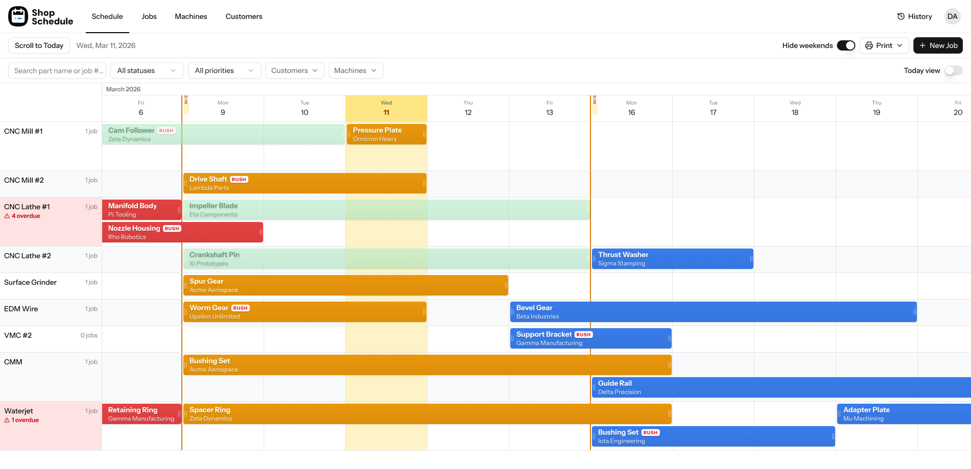
The product is organized around four views: Schedule (Gantt), Day View, Jobs, and Customers. The Gantt is the primary view, the one you'd look at to understand the shop's week. Everything else supports it.
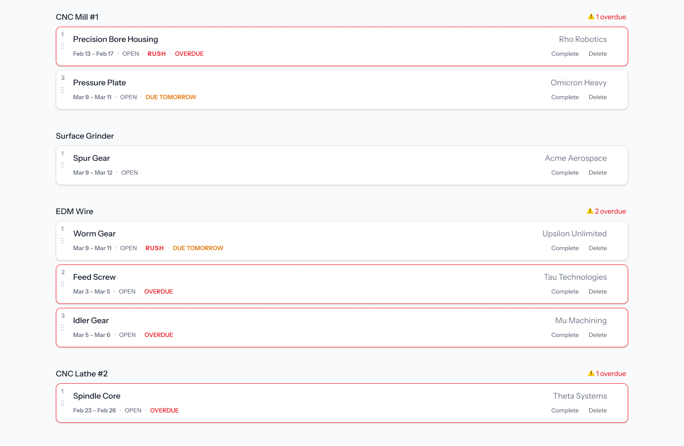
Day View as a secondary lens. The Gantt is excellent for planning across a week or two. But every morning, someone walks in and wants one thing answered: what's on deck today? The Day View groups jobs by machine for the current day, each flagged with RUSH, OVERDUE, or DUE TOMORROW badges. It mirrors what a morning shift board looks like, familiar enough that no one needs to be trained on it.
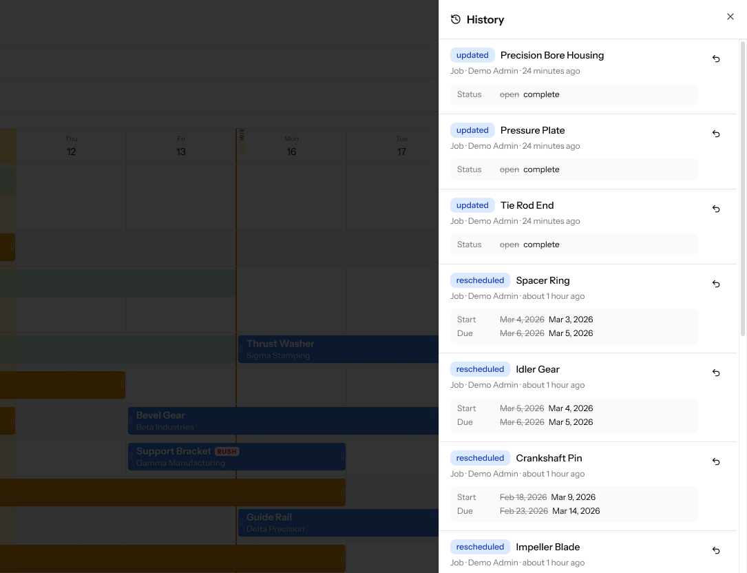
History & Undo as a trust layer. Machine shop owners are cautious about new software. Rescheduling something accidentally on a whiteboard means picking up a marker. Doing it on digital software (before trust is built) feels higher stakes. The History panel logs every scheduling change with a timestamp, with a one-click revert next to each entry. This wasn't just a safety net: it was the thing that made owners comfortable experimenting with the Gantt in the first place.
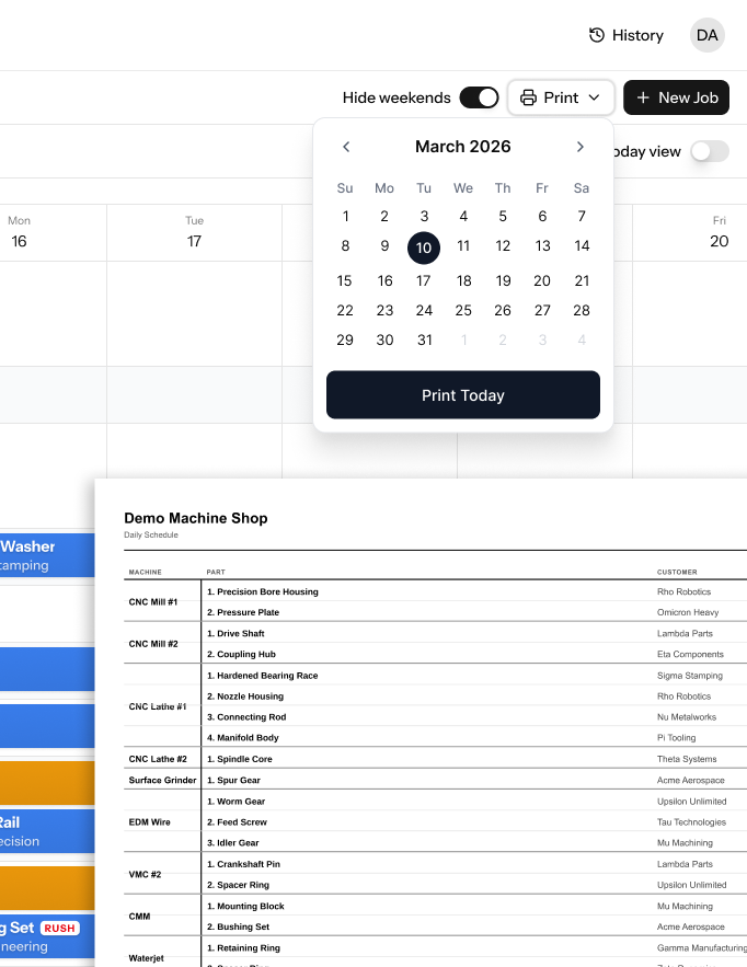
Print Schedule for the shop floor. Every shop we talked to during discovery had a paper schedule somewhere, posted near the machines, in a binder, handed out at the start of a shift. Rather than trying to change that behavior, Shop Schedule generates a clean, print-ready daily schedule in one click. Machine, part, customer, due date — formatted for a piece of paper, no reformatting required.
Rush and Overdue flags in context, not in a separate panel. Urgency signals live directly on the Gantt bars and Day View cards. Flags are visible across all views so nothing gets buried in a notification feed nobody checks.
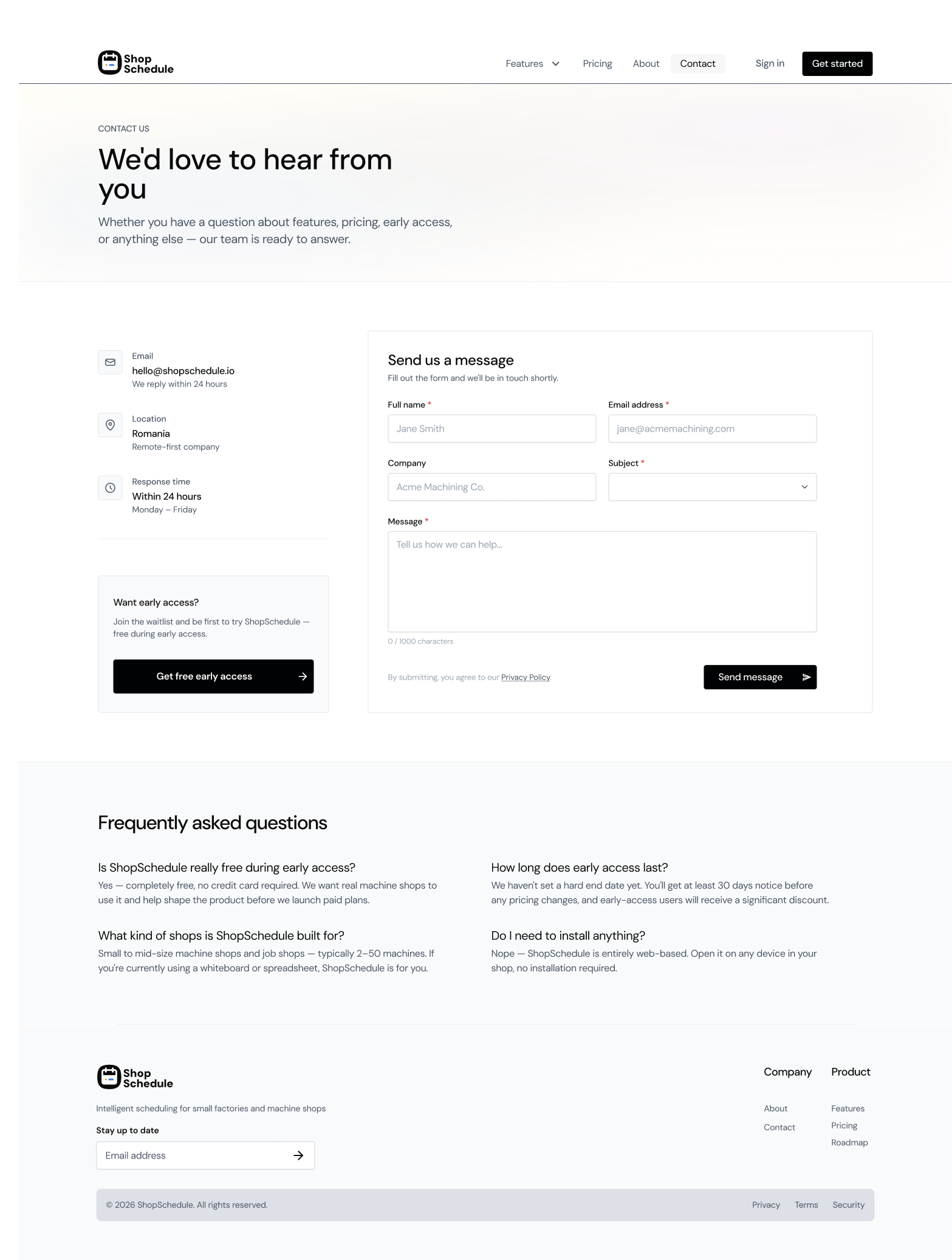
Shop Schedule launched across Product Hunt, Show HN, and a set of niche manufacturing directories. The early access program is free with no credit card required, the goal being to get real shops using it before locking in the feature roadmap. Customer discovery is ongoing through conversations with shop owners on Signs101 and machining communities on Reddit.
The marketing site was designed as an extension of the product: same directness, same respect for the user's time. The About page leads with the product's origin ("We built the tool we wished existed") and the company's four operating principles, built for the shop floor, radical simplicity, customer-driven roadmap, and honest pricing. No enterprise marketing language, no feature grids.
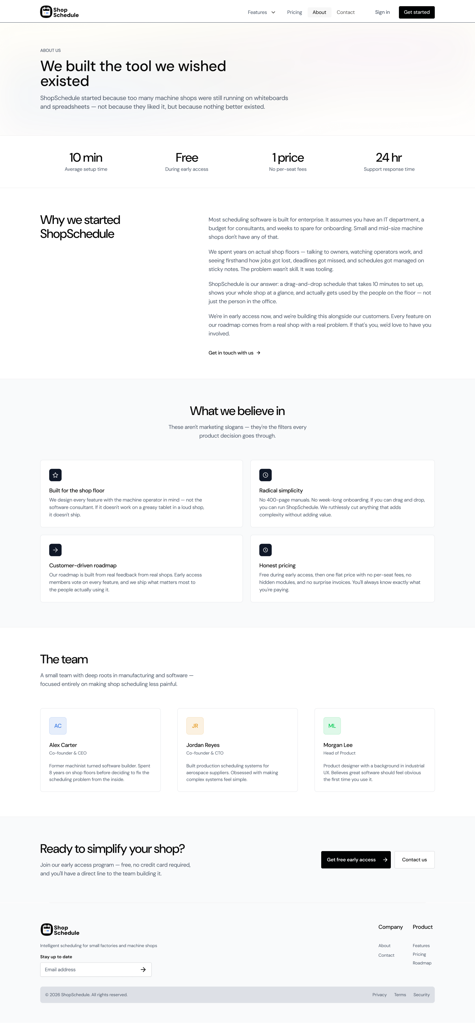
"The instinct in product design is to add, more features, more configuration, more flexibility. For machine shop owners, the right answer was almost always to remove. Every option that required explanation was a potential reason to close the tab."
Building for a non-tech audience demands a different kind of restraint. The pull toward adding features is strong when you're the designer, the product manager, and the developer in the same week. For machine shop owners, simplicity isn't a nice-to-have, it's the product. Every option that required an explanation in the UI was a failure to make the right decision earlier.
Doing all of it alone surfaces tradeoffs that team projects don't. When you're both the designer and the person writing the copy, you notice fast when the UI language and the marketing language diverge. When you're configuring DNS and designing the contact form and writing the FAQ in the same afternoon, you develop real opinions about what onboarding friction feels like from the other side.
Trust is the actual product in early-stage B2B software. The consistent signal from early feedback: people want to know it works before they commit to learning it. The demo data, the print schedule, and the History & Undo feature all serve the same goal, reduce the cost of trying. The whiteboard isn't the competitor. The fear of switching to something unknown is.